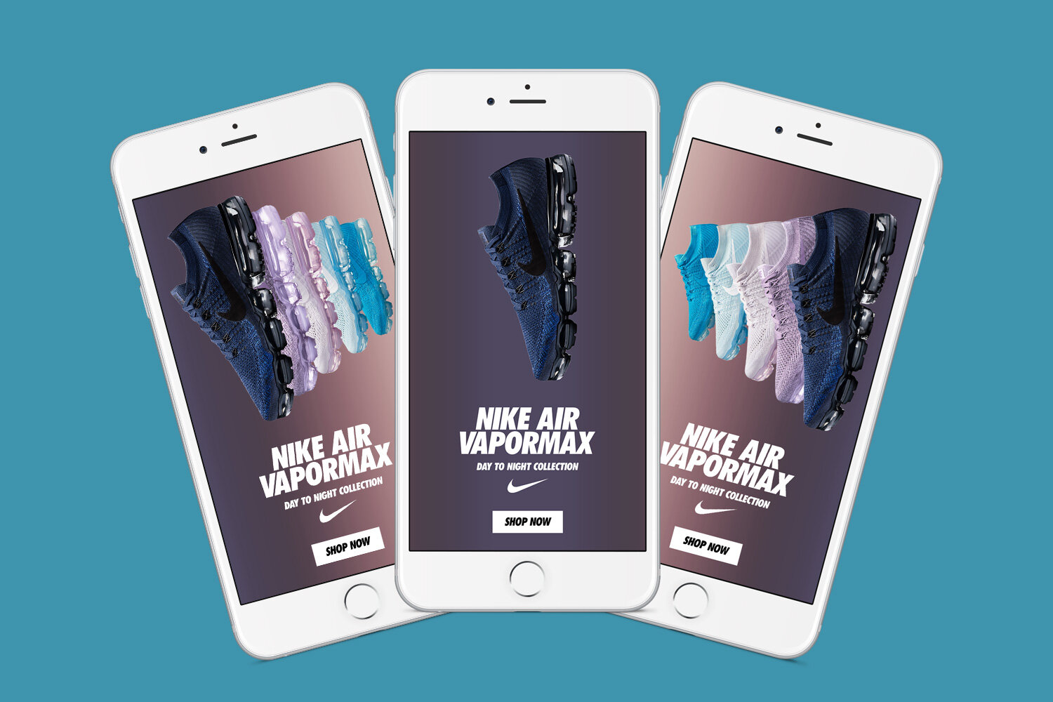
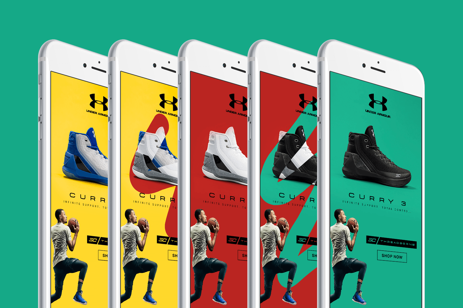
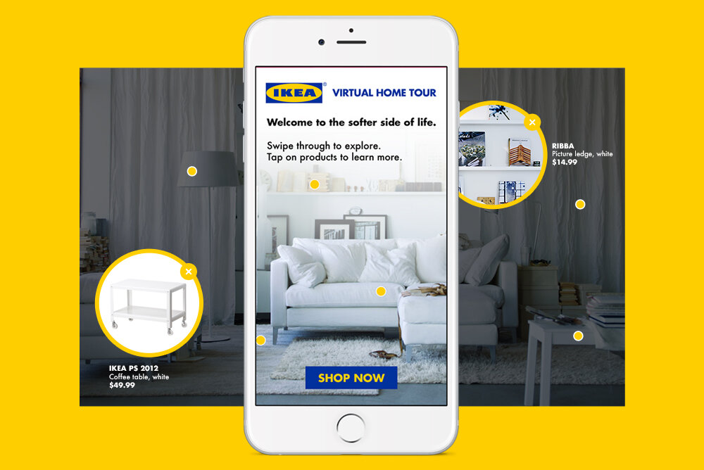
Kargo is a global ad tech company that creates award-winning campaigns for leading brands. As Director of Ad Design & Innovation, I oversaw production of hundreds of mobile campaigns, ensuring that that each ad creative reflected Kargo’s commitment to “art in ad tech.”
DIRECTOR OF AD DESIGN & INNOVATION / KARGO, 2013–2018
client pitch: AT&T
With AT&T’s Unlimited campaign, we used contextual targeting to reach sports fans across relevant publisher properties such as Sports Illustrated and Bleacher Report. To drive home the value of AT&T’s unlimited data plan, I designed an in-article ad that leverages the mobile gyroscope. Any slight movement of one’s device triggers an accordion of “unlimited” college basketball games, while the subhead loops through “unlimited” basketball moments, like slam dunks and buzzer beaters. The user-controlled animation elicited a pause mid-scroll, ultimately raising awareness of AT&T’s plan through intentional engagement with the ad.
client pitch: target / cnet
For this sponsored content pitch, we wanted to “wrap” CNET’s holiday gift guide with Target branding. The experience starts at the top of the page, with a thick banner featuring Target’s slogan alongside their mascot, “Bullseye” the dog.
As the user scrolls, Bullseye follows. As the price of each product comes into view, Bullseye slides horizontally across the page and reveals the sale price, with a corresponding “See at Target.com” CTA.
This concept wasn’t designed with scale in mind, but rather as a custom execution that would marry the editorial experience (CNET) with the brand experience (Target). While this particular idea never came to fruition, it did inspire some tinkering to see if it would be technically feasible to have a brand element (like the dog) drop out of a top banner and persist as the user scrolls down the page.
internal product development: glossier
Many publishers seek to monetize the bottom banner ad slot, but advertisers are weary of “banner blindness” (and rightfully so). Working within the constraints of that slot, I sought to design a format that could effectively combat banner blindness. I proposed a branded drawer that slides in from the bottom of the screen, overlaying less than 30% of the editorial content (in accordance with IAB rules). The ad teases a few products, then collapses after three seconds. The user can then initiate full expansion of the ad by swiping up. I designed this format with DTC brands in mind – ie. brands with audiences that are digital natives, and thus familiar with “swiping up” in other contexts (such as Instagram Stories). I also wanted to design a format that could be automated. If we had enough demand, we could build a template requiring limited brand assets (logo, primary color, font, images) and lower the dev costs usually associated with premium ad products.
client pitch: general motors / cadillac
As the design lead for AdLabs – Kargo’s custom consulting arm for major client engagements – I had the opportunity to work on a large proposal for General Motors. Cadillac’s “Art of Daring” campaign highlighted artists that embodied the brand’s “dare greatly” ethos. I set out to translate the campaign to mobile through a series of scroll-reactive ads – each one celebrating a different work of art found on the streets of US cities, as seen from the perspective of a Cadillac driver. I wanted to emphasize Cadillac as a vehicle (no pun intended) for “off the beaten path” discovery (no pun intended), as well as a champion of art and culture. As the user scrolls down the page, the art animates to give the illusion of a car in motion, while also drawing attention to the ad.
CASE STUDY: SPOTLIGHT AD FORMAT
In addition to executing mobile campaigns such as the ones featured above, I regularly collaborated with Kargo’s Ad Product team on ideation, prototyping, and development of new ad formats. “Spotlight” was one of my favorite projects, and continues to drive a significant amount of revenue for the company.
With Spotlight, we set out to achieve the following goals:
Reduce dependency on third party platforms.
Create demand for the excess supply of middle banner inventory.
Make the ad as templated as possible to automate production and drive scale.
Make the ad lightweight to reduce latency upon load.
SPOTLIGHT EXPLORATIONS
The first iteration consisted of one full-screen image, masked by a cutout 250px in height. The viewport would move as the user scrolled, revealing segments of the larger image:
Spotlight 1.0
Spotlight 1.0 posed a couple of challenges. First, how do we lay out the elements so that the ad makes sense when revealed from the bottom up? (Should the CTA be positioned at the top of the ad, so it’s the last thing the user sees upon scrolling?) Second, how do we ensure that key elements, such as logo and legal copy, are always in view?
Spotlight 2.0
For the second iteration (left), we pulled out the messaging, logo and CTA as a transparent PNG to be layered over the full-screen image. This way, critical brand elements persist in the foreground; always in view regardless of user scrolling.
We launched Spotlight 2.0 and it was well-received by advertisers and publishers alike: publishers were pleased with its non-intrusive nature (perfect for an editorial environment), and advertisers liked that the format had a parallax-feel to it, without requiring any custom assets or animation.
About a year later, I had moved into management and was itching for some creative work. I decided to revisit Spotlight and experiment with more interesting, less templated executions:
By playing with positive and negative space using the foreground image, I was able to give the illusion of depth while still using only two static images. While this version of Spotlight was less turnkey than the previous, it created far more opportunities for delight. In an industry where everyone is obsessed with “scale,” I always found custom executions to be more compelling.
FINAL THOUGHTS
My self-initiated mocks rekindled sales of Spotlight units, and found their way into countless proposals.
When it comes to mobile advertising, it’s rare to have someone pause and appreciate an ad. So when that happens, you know you’re doing something right.


